Overview
As a developer, at some point in your work, you might have come across a strange maybe but a valid requirement. The client says I want “different layouts” for landscape and portrait  . He maybe valid at his perception but this gives you a burden. None of us like that. But it’s a pretty easy thing to do and here we’re going to learn how. It’s so easy that you won’t even have to write a line of code but do it just through interface builder. You’ll be surprised by how much power has the interface builder put in your hands.
Content Adaptation
Auto layout is a powerful tool when it comes to design. You can design for any particular device and by giving proper constraints you increase the design’s compatibility with other devices. But when it comes to having totally different layouts for device orientations, you got to work a little more to achieve desired results.
For understanding this concept of adaptive auto layout, it’s important for you to understand the size classes as you’ll be working around them to have adaptive layouts for orientations. Below you can see a chart where size classes are explained in brief.
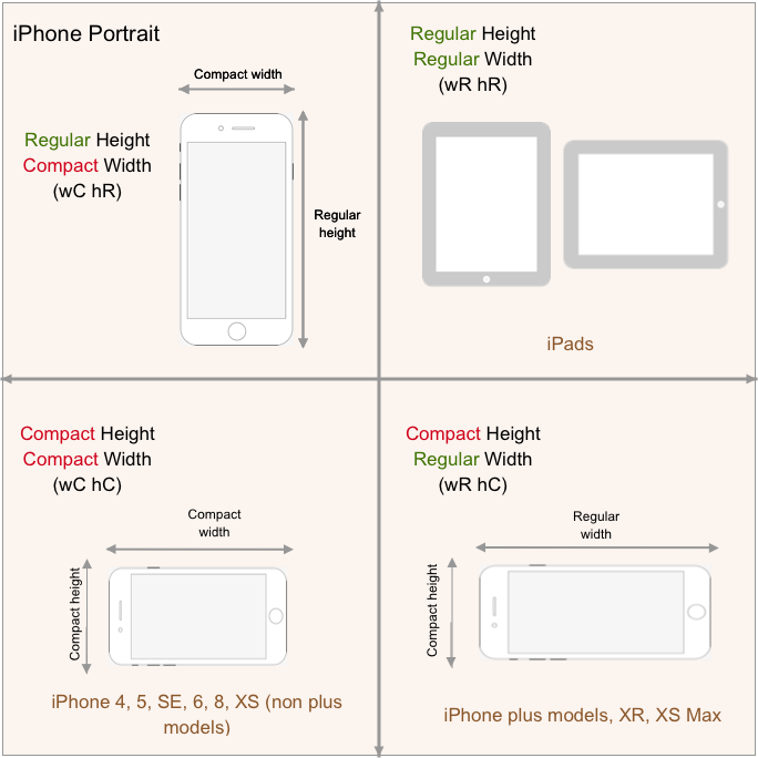
So, you have to play around size classes. For orientation purpose you will be working with height, i.e. You’ll be varying your layout on varying height. If height is Regular(Portrait) we will make Layout1 and when height is Compact(Landscape) we will make Layout2. Keeping that in mind.
Note:- This adaptation won’t work on iPads as it has Regular height in both landscape and portrait mode 🤷♀️. You have to work around code for that. I’ll show you how in part 2 of this blog.
But before we move on to working through the storyboard, let me show you what we will be working for. Here’s a Slo-mo for the result we will be getting.
Impressive, eh?
Working On:-
- Step 1:- Create a project. ✔️
- Step 2:- Read on.
I created a project named BlogAdaptiveLayout. And I started working on the storyboard. I wanted to make an app with details about Harry Potter and his profile picture.
Things we are going to do.
- Different layout design for different orientation
- Varying fonts
- Varying background image
Looks like a tone of work, but don’t worry, it’s pretty easy, like magic.
So far, I arranged all my components and gave them constraints. This is how it looks so far.
For those who don’t like the auto layout, this might look scary. Don’t worry, I’ll guide you through.
The constraints I’ve given so far are:
- Background imageView with top Constraint from the safe area and all other from the superview.
- Profile image:- Fixed height, width, and spacing from the top, Horizontally central aligned.
- Name label:- Vertical spacing from profile image view and leading space to the container.
- All other labels:- leading to label above it and vertical spacing of around 40 from the same.
So, we’re done with basic steps, easy, Right? Remember you have done all this for Regular height.
Now you’ll have to switch the orientation to landscape from the bar below. The reason is that we have created portrait design now we want for landscape or we can say we’ll work with compact height. Next step will be to click on Vary for Traits.
Select Height from the given two Options as we are working our way around the height. Everything we do for layout adaptation for orientation is based on height as height is the only size class that switches between regular to compact when going from portrait to landscape in all iPhones. If you try playing around width, it won’t switch to Regular in non-plus devices like SE, 6, 8 and even XS. Hope it’s pretty clear why height.
When you click on height, the bottom bar turns to a pretty shade of blue, like below.
As long as this bar is blue, you can know that every change you make now will reflect in this orientation or the landscape mode. If this bar is not blue, any changes you’ll do will even mess up your layout of portrait mode.
Changing background
Yes, you can have different images for imageView in a different orientation. So I added two images to my Assets Catalog named ”portrait” and “landscape”. While designing the portrait mode I gave it image as the “portrait”. If you simply change image name at this point then the image will change for both orientations. Then, what should you do? I’ll show you.
- Select your imageView, go to the attributes inspector.
- Click on the little plus near the image option.
-
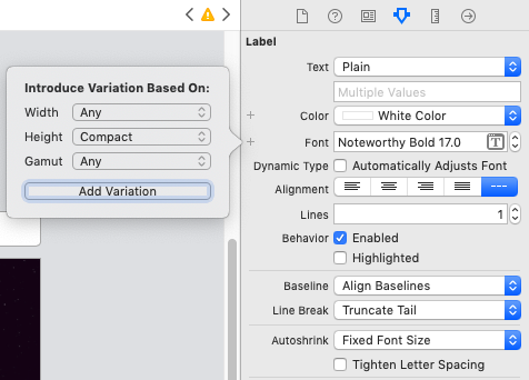
- Add variation keeping the height compact and width to any as we don’t care about width right now.
Note:- And if you try to give width then it will work for some device and won’t for some based on size classes.>
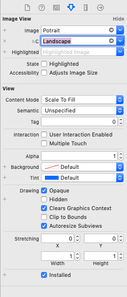
- After you’ve added variation, it should look something like this
- A small hC will appear near the text field. It means this variation is for Compact height.
- Simply give the name of your image and Voila!! The image has changed. If you wish you can click on done variation and try switching to landscape and portrait mode and see the changes. But don’t forget to enter the blue thingy mode again by clicking Vary for Traits.
Changing Fonts
- The process is pretty much similar. Just select all your labels. Go to the attributes inspector.
- Click on the little plus besides font.
- Add variation for compact height.
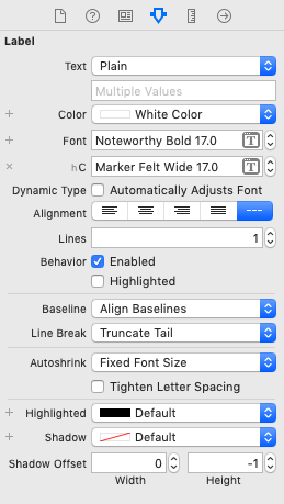
- This is how it looks after selecting and entering fonts.
- A small hC besides Font.
- So for portrait, our fonts will be “Noteworthy” and for landscape, our fonts will be “Marker felt”.
- You can change the color, size, background color.
- You can change anything with a plus mark on its side in attributes inspector.
So after doing this easy but noticeable changes, this is how far we’ve come.
- You can again check if it has worked by clicking done varying on the bottom blue bar.
Wouldn’t it be nice if we could get the profile picture on the left side and all details on the right side for landscape mode? Hang On.
Changing/ Uninstalling Constraints
- So as per my new design, I’ll be deleting or technically uninstalling constraints.
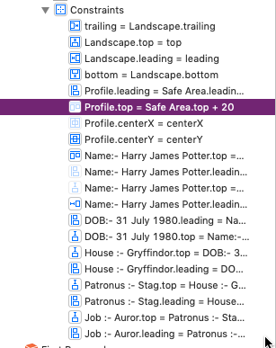
- I don’t need four constraints anymore, the center alignment of profile picture, leading constraint of the label to superview and vertical spacing between profile and label, the spacing of profile to superview.
- Simply select the constraint and press backspace.
- After uninstalling constraints, they’ll appear light in color
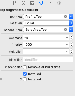
Note:- If you want to re-install constraint. Simply select the constraint and go to attribute inspector and select the variation you want to install constraint for.
- Now simply add new constraints according to required layout.
- Here’s what I’ve done
- Give the profile image vertically aligned at center.
- From profile’s trailing give 20 horizontal space to the first label.
- Give any top constraint to the first name label.
- To change the value of existing constraints, simply double click and change the value, rest will be handled by Xcode.
- You can also change the value of existing constraints by selecting constraints and going to attribute inspector and follow the same process we did before.
- Here’s the Result
- Click on “Done Varying”. Switch, switch, switch the orientations, it works. 10 points to Gryffindor!!
SUMMING UP
So, now you’ll be capable to do even complex designs, all you need is practice. Just be careful with those constraints. Just keep the above steps in mind and operate them on your designs or you can just flick and swish your wand, say a charm and it’s done. Come back for the next blog to learn how to make content adaptive for iPads. And most of all, thank you for your patience 
 .
.
If you have any query please feel free to reach out.


