Overview
Material design is created by team of engineers and UX designers at Google.
MDC provides attractive and functional UI components and is available for Android, iOS, Web and Flutters.
Material design is system for building beautiful apps in iOS(swift) by using Material components.
Material components for iOS(MDC-IOS) creates consistency between apps & websites.
Installation of Material Components in Project
Installation with cocoapods
Add the following to your pod file.
pod ‘MaterialComponents’
Then run the following command
pod install
Importing
Then import the Material components.
For ex. import MaterialComponents.MaterialBottomAppBar
List of Useful Material Components(MDC)
- Buttons
- Textfield
- Chip view
- Bottom view
- Snack bar(Bottom toast)
- Tab bar
- Slider
- Spinner(Loader)
- Highlighted view
- Page control
1. Buttons
- There are three types of button in Material components.
- Flat, raised and floating button.
- All buttons show ink splashes when user interacts with the button.
- You can set elevation for particular control state of button.
- Floating action button can be animated using collapse and expand method.
//For MDCButton
        let button = MDCButton()
        button.setElevation(ShadowElevation(rawValue: 6), for: .normal) // For add shadow on button.
        view.addSubview(button)

//For MDCFloatingButton
        let floatingButton = MDCFloatingButton()
        floatingButton.setImage( UIImage(named: "Favorite"), for: .normal)
        floatingButton.backgroundColor = .white
        floatingButton.setElevation(ShadowElevation(rawValue: 6), for: .normal)
        floatingButton.addTarget(self, action: #selector(btnTapped(button:)), for: .touchUpInside)
        view.addSubview(floatingButton).

@objc func btnFloatingButtonTapped(floatingButton: MDCFloatingButton){
        floatingButton.collapse(true) {
            floatingButton.expand(true, completion: nil)
        }
    }
2. TextField
- There are two main types of Text Fields in material components.
- MDCTextfield and MDCMultilineTextField.
- MDCTextfield is used for single line text input and MDCMultilineTextField for multiline text input.
- We have to add textfield in ‘MDCTextInputControllerUnderline(textInput:)’ as text input for floating placeholder and underline.
//For animate placeholder and underline
var textFieldControllerFloating: MDCTextInputControllerUnderline!

//Multiline text Field
let textFieldFloating = MDCMultilineTextField()
        textFieldFloating.textView?.delegate = self
        textFieldFloating.placeholder = "Enter UserName"
        textFieldFloating.expandsOnOverflow = false
        textFieldControllerFloating = MDCTextInputControllerUnderline(textInput: textFieldFloating)
        textFieldControllerFloating.characterCountMax = 15
        textFieldControllerFloating.floatingPlaceholderActiveColor = UIColor.lightGray
        textFieldControllerFloating.errorColor = .red
        view.addSubview(textFieldFloating)

//Text view delegate for animate placeholder
func textViewDidChange(_ textView: UITextView) {
        let txt = textView.text.trimmingCharacters(in: .whitespaces)
        textFieldControllerFloating.isFloatingEnabled = !txt.isEmpty
    }
3. Chip View
- There are two main types of chip view: Action chips and Choice chips.
- Action chip offer action related to primary content. You can change UI according to action.
- Choice chips allow selection from multiple chips.
- Choice chips clearly indicate exact position and display options in a compact area.
- You can use chips as toggle, radio button and single selection menu by customizing chip view.
//Chip view with image
        let chipView = MDCChipView()
        chipView.sizeToFit()
        chipView.titleLabel.text = "Chip With Image"
        chipView.setTitleColor(UIColor.red, for: .selected)
        chipView.addTarget(self, action: #selector(chipViewTapped(_:)), for: .touchUpInside)
        self.view.addSubview(chipView)

//Tap action of chip view
@objc func chipViewTapped(_ sender: MDCChipView){
        sender.imageView.image = UIImage(named: "Favorite")
        sender.imagePadding = UIEdgeInsets(top: 0, left: 10, bottom: 0, right: 0)
    }
4. BottomView
- Bottom View works much like a UITabBar and both are populated with an array of UITabBarItems.
- It is to be suggested that at most three to five bar items are to be used.
- User can add title as well as image in BottomView.
//Setting up Bottom View
   let bottomView = MDCBottomNavigationBar()
   bottomView.items = [
            UITabBarItem(title: "Home", image:UIImage(named: "Home"), tag: 0),
            UITabBarItem(title: "Message", image:UIImage(named: "Email"), tag: 1),
            UITabBarItem(title: "Favorites", image: UIImage(named: "Favorite"), tag: 2),
            UITabBarItem(title: "Calls", image:UIImage(named: "calls"), tag: 3),
            UITabBarItem(title: "More", image:UIImage(named: "more"), tag: 4)
        ]
   bottomView.selectedItem = bottomView.items.first
   bottomView.titleVisibility = .always
   bottomView.alignment = .centered
   view.addSubview(bottomView)
5. SnackBar
- Snackbars provide brief feedback about an operation through a message at the bottom of the screen.
- It shows up normal readable text upto two lines.
- Pop ups only contains text action.
//Setting up Snack Bar
    let message = MDCSnackbarMessage()
        message.text = "This is a SnackBar Toast"
        let action = MDCSnackbarMessageAction()
        let actionHandler = { () in
            let answerMessage = MDCSnackbarMessage()
            answerMessage.text = "Fascinating"
            MDCSnackbarManager.show(answerMessage)
        }
        action.handler = actionHandler
        action.title = "ok"
        message.action = action
        MDCSnackbarManager.show(message)
6. TabBar
- These tabs act like bar buttons, used to navigate between Screens.
- On the selected tab user is redirected to related Subject Content.
- It works on the behaviour of MDCTabBar that communicates via a delegate.
//Setting up Tab Bar
        let tabBar = MDCTabBar()
        tabBar.items = [
            UITabBarItem(title: "Home", image:  imageLiteral(resourceName: "Home"), tag: 0),
            UITabBarItem(title: "Message", image:  imageLiteral(resourceName: "Email"), tag: 1),
            UITabBarItem(title: "Favorites", image:  imageLiteral(resourceName: "Favorite"), tag: 2),
            UITabBarItem(title: "Calls", image:  imageLiteral(resourceName: "calls"), tag: 3),
            UITabBarItem(title: "More", image:  imageLiteral(resourceName: "more"), tag: 4)
        ]
        tabBar.selectedItem = tabBar.items.first
        tabBar.alignment = .center
        tabBar.itemAppearance = .titledImages
        tabBar.barTintColor = .white
        tabBar.selectedItemTintColor = .black
        tabBar.unselectedItemTintColor = .gray
        tabBar.selectionIndicatorTemplate = IndicatorTemplate()// Custom class for selected Tab indicator
        tabBar.autoresizingMask = [.flexibleWidth, .flexibleBottomMargin]
        tabBar.sizeToFit()
        view.addSubview(tabBar)
7. Slider
- MDCSlider is a third party control used to propagate between range or discrete set of values.
- The current slider height is set to 27pt, to make enough space so that touches don’t affect other elements.
- Discrete sliders shows value indicator by set numberOfDiscreteValues property.
let slider = MDCSlider()
        slider.shouldDisplayDiscreteValueLabel = true
        slider.isEnabled = true
        slider.numberOfDiscreteValues = 5
        slider.minimumValue = 0
        slider.maximumValue = 100
        slider.inkColor = .black
        slider.isThumbHollowAtStart = true
        slider.addTarget(self, action: #selector(didChangeSliderValue), for: .valueChanged)
        view.addSubview(slider)

//Slider value change method
 @objc func didChangeSliderValue(_ sender: MDCSlider){
        sender.isStatefulAPIEnabled = true
        sender.setThumbColor(.red, for: .selected)
    }
8. Spinner(Loader)
- Material Design allows user to display a loading indicator with multi color support.
- User can use two styles of indicator :- linear and circular
- It has a property to set multiple colors, i.e cycleColors which allow to add colors property.
let activityIndicator = MDCActivityIndicator()
        activityIndicator.sizeToFit()
        activityIndicator.progress = 0.4
        activityIndicator.cycleColors = [.blue, .red, .green]
        activityIndicator.center = self.view.center
        view.addSubview(activityIndicator)
        activityIndicator.startAnimating()
9. Highlighted View
- The Highlight view component is a way to visually highlight a part of the screen in order to introduce users to new features and functionality.
- Through this you can highlight a view, and at a time display another view with different animations.
- For example :- Switching the main view with highlighted view.
var highlightController: MDCFeatureHighlightViewController!
        highlightController = MDCFeatureHighlightViewController(highlightedView: welcomeButton, completion: nil)
        highlightController.bodyColor = .white
        highlightController.titleColor = .white
        highlightController.titleText = "Welcome Sir!"
        highlightController.bodyText = "Text which you want to display when highlight"
        highlightController.outerHighlightColor =
            UIColor.black.withAlphaComponent(kMDCFeatureHighlightOuterHighlightAlpha)
        present(highlightController, animated: true, completion: nil)
10. Page Control
- MDCPageControl is designed in replacement of Native UIPageControl
- MDCPageControl shows current page index, with its positioned indicator.
- As the user scroll the page, the indicator in MDCPageControl navigates it’s indicator towards the next indicator position that is being scrolled towards.
let pageControl = MDCPageControl()
        pageControl.numberOfPages = 3
        let pageControlSize = pageControl.sizeThatFits(view.bounds.size)
        pageControl.addTarget(self, action: #selector(didChangePage), for: .valueChanged)
        pageControl.autoresizingMask = [.flexibleTopMargin, .flexibleWidth]
        view.addSubview(pageControl)

    /// Change page control
    ///
    /// - Parameter sender: MDCPageControl
    @objc func didChangePage(sender: MDCPageControl){
        var offset = scrollView.contentOffset
        offset.x = CGFloat(sender.currentPage) * scrollView.bounds.size.width;
        scrollView.setContentOffset(offset, animated: true)
    }
Advantages and Disadvantages of Material Design and Material components(MDC) for iOS
Advantages:
- Material design are minimalistic and stylish as compared to native components of iOS.
- More intuitive and Material design is great both for experienced users and new users.
- Material components looks Moderately skeuomorphic.
- Material components uses animation so animations help users grasp the UI better.
Disadvantages:
- Owned by google so it will be hard to improve something that you are not satisfied with without asking the proprietor.
- Material components may take long time to implement compared to native iOS components.
- Motion can be very energy-consuming.









 .
. . Yes, you read it right 5 million. It’s a pretty big market, you got to get your app discovered and noticed in the crowd of all these apps and the metrics provided by the App Store are just the thing you need for this purpose.


 .
.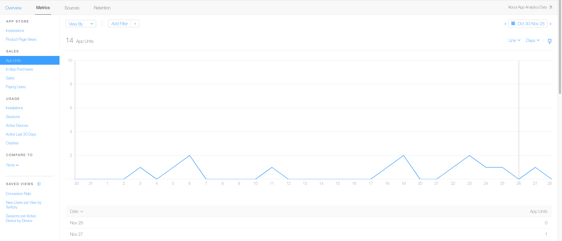
 earned by your app or the revenue generated by your app, this is the total of app purchases and in-app purchases but remember, you won’t get all of the revenue generated. Apple gets to take the 30% and the remaining 70% is your own.
 . Through these metrics, you can observe whether the app is doing well or it is in need of improvements.
 !!
!!


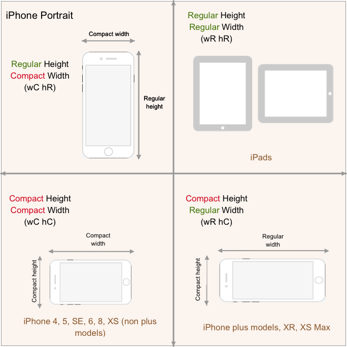
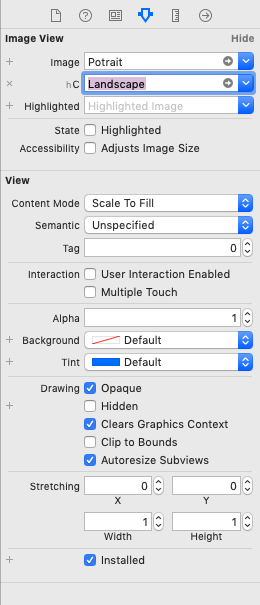
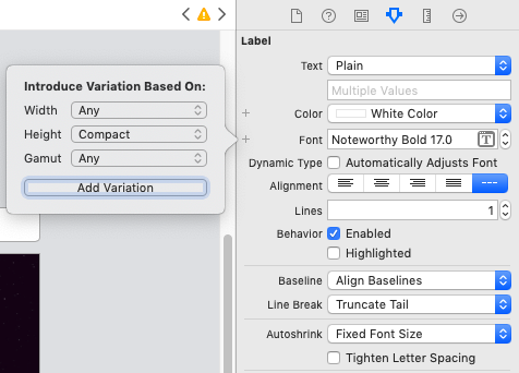
 . He maybe valid at his perception but this gives you a burden. None of us like that. But it’s a pretty easy thing to do and here we’re going to learn how. It’s so easy that you won’t even have to write a line of code but do it just through interface builder. You’ll be surprised by how much power has the interface builder put in your hands.






 .
.


